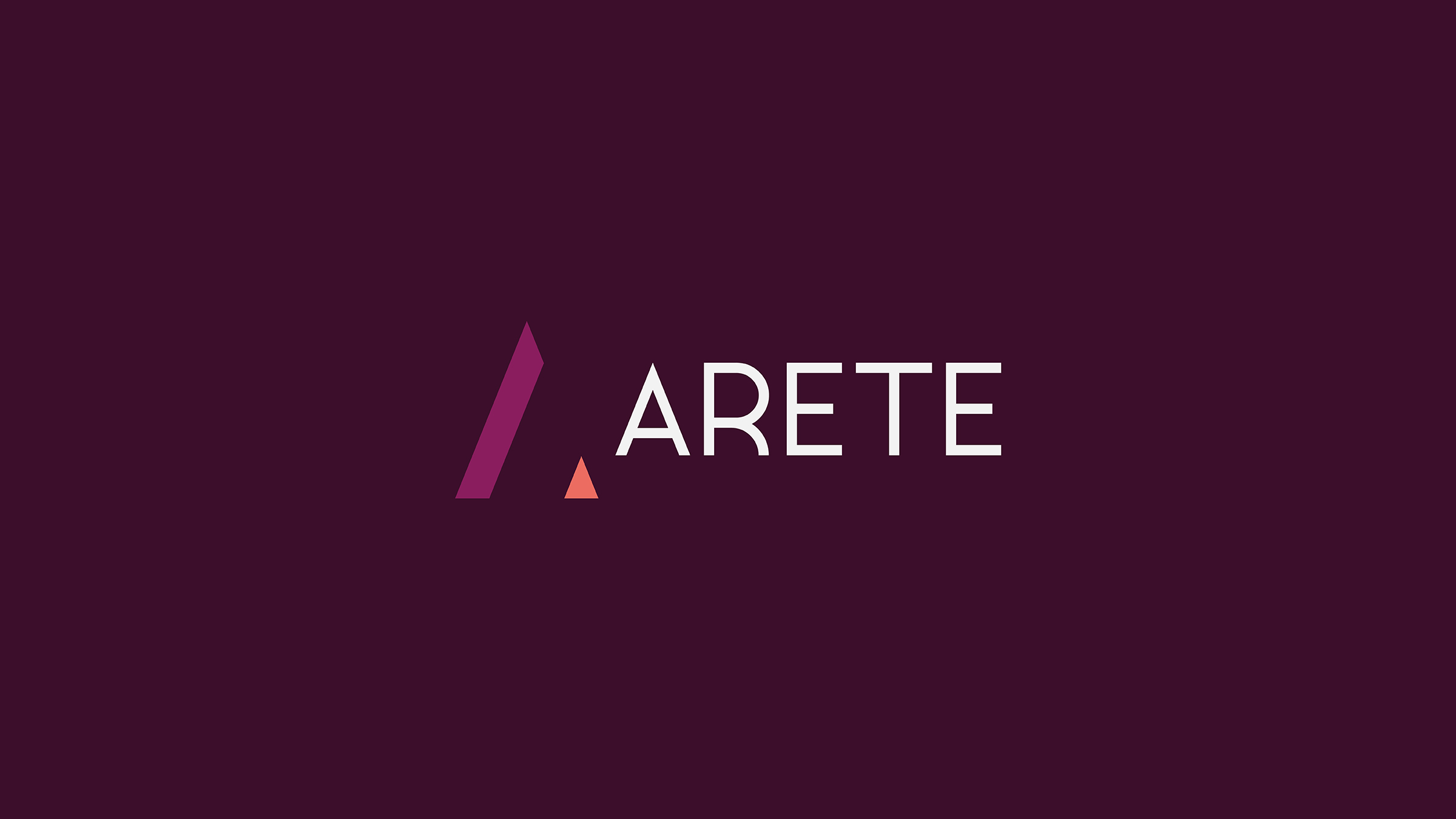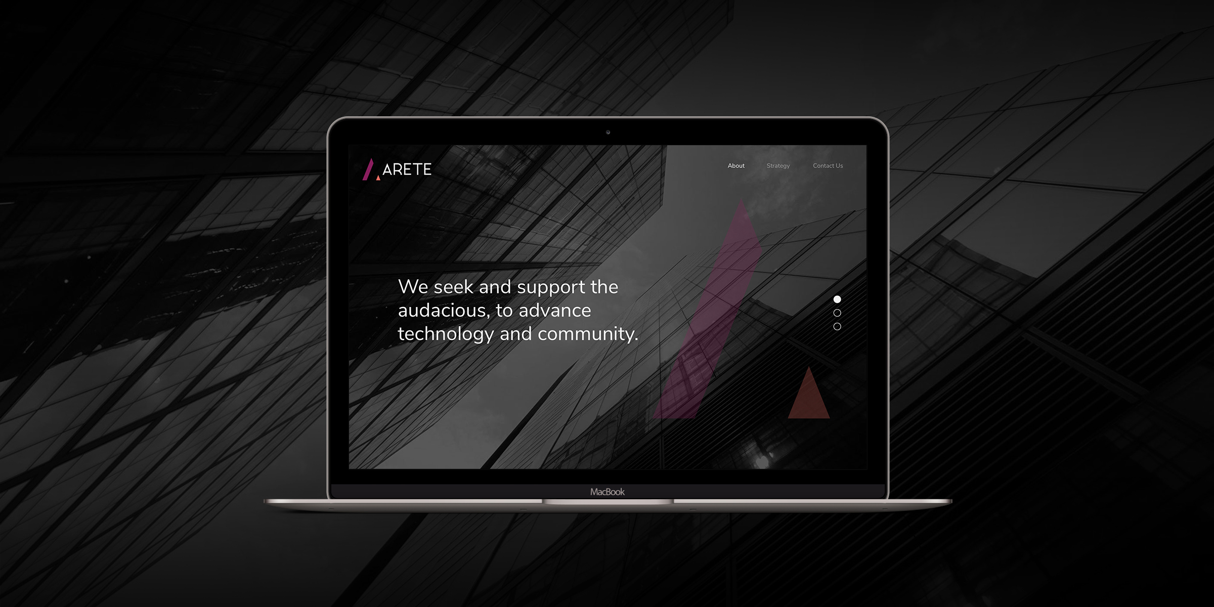
Arete Equity is a hedge fund company in which the name represents “heroic virtue, excellence or fulfillment of maximum potential or purpose”.
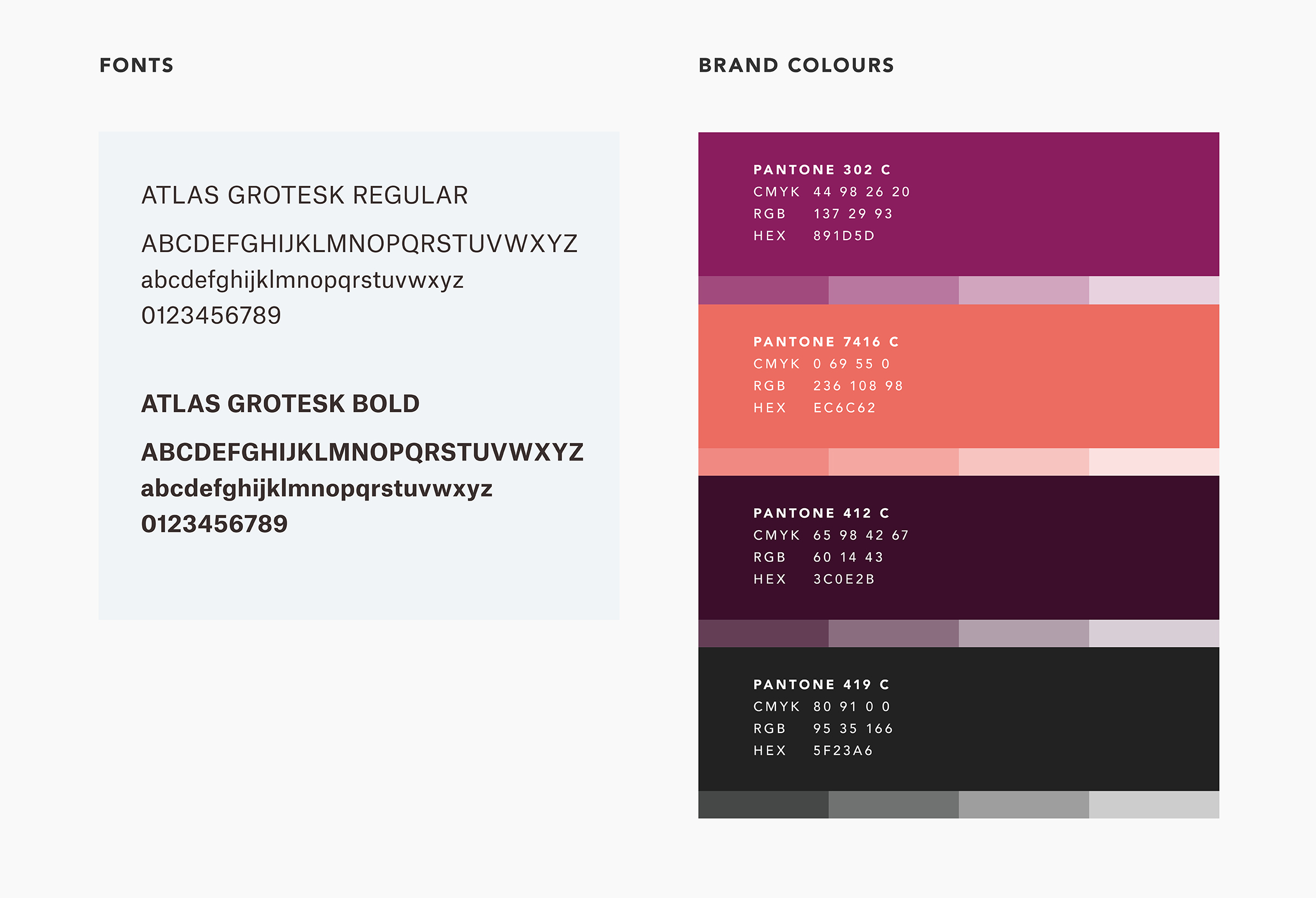
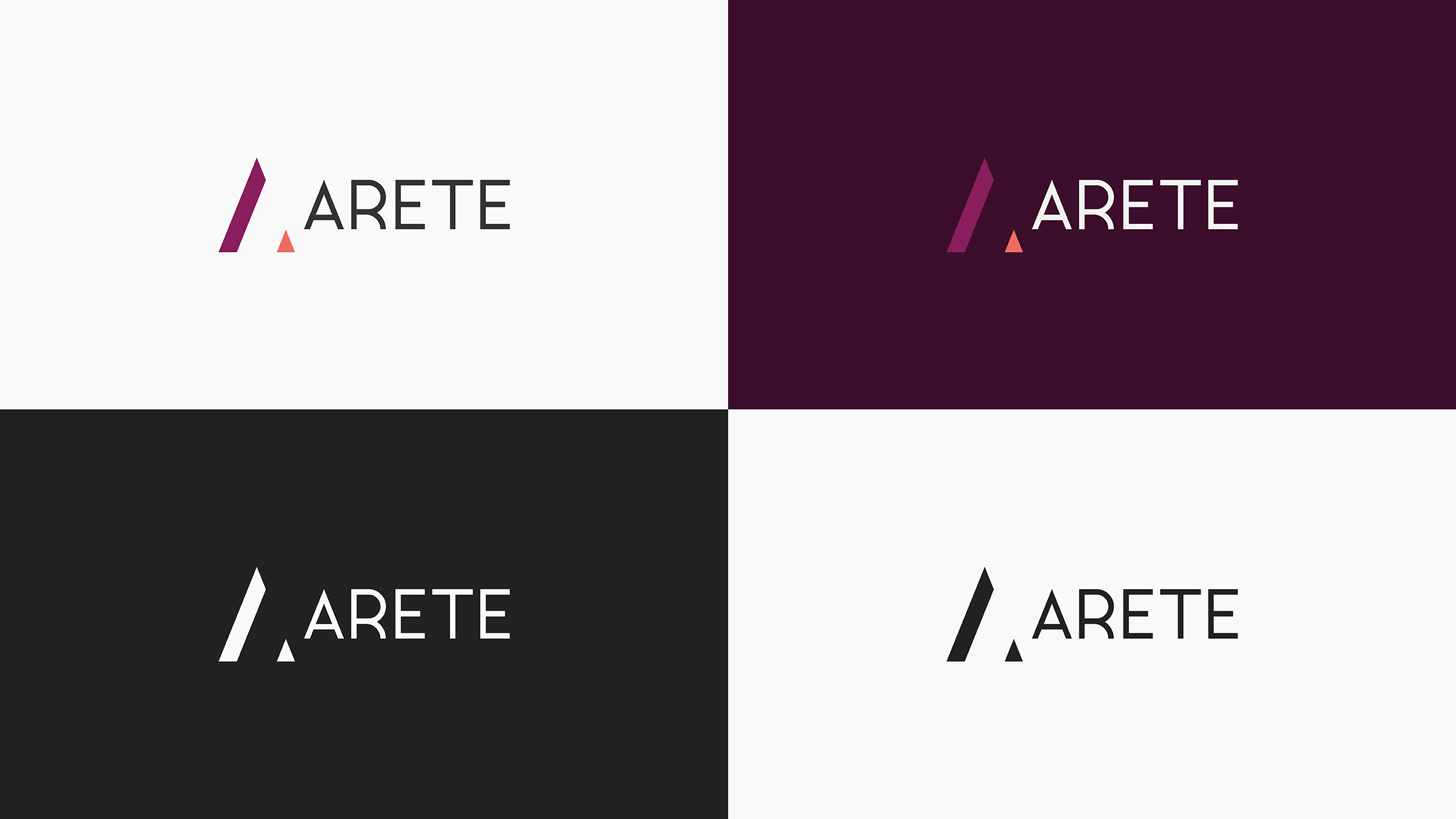
When designing the logo, an upward-pointing triangle - representing stability is used as a basis. That, along with the subtle representation of an ‘increase’ (ascension from left to right) is used to represent the “fulfillment of maximum potential or purpose”. Purple is used as the primary brand colour as the color communicates nobility, a sense of value, bravery (heroic), and spiritual (higher purpose) qualities.