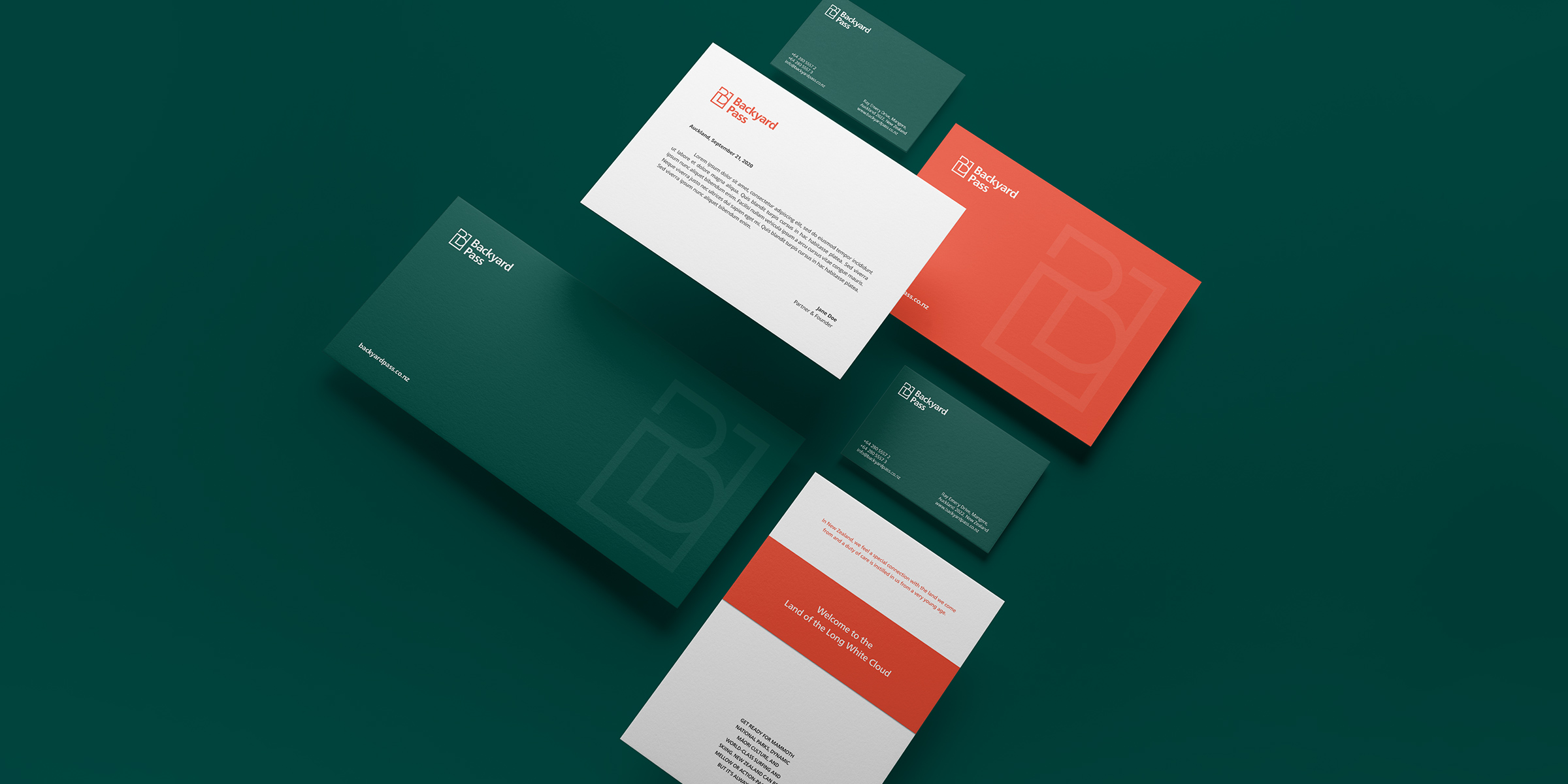
Travel and tourism have been one of the main industries to be gravely affected by the COVID-19 pandemic globally.
To tackle the issue of allowing people to still travel and experience all the beauty and fun that surrounds them in New Zealand, Backyard Pass was established with 1 clear mission—to allow locals to experience everything in their backyard, for less.
Through a discovery session with the Backyard Pass team, we identified two primary target user groups. With this in mind, we designed an identity which not only speaks of it’s company values but also appeals to their main target audiences.
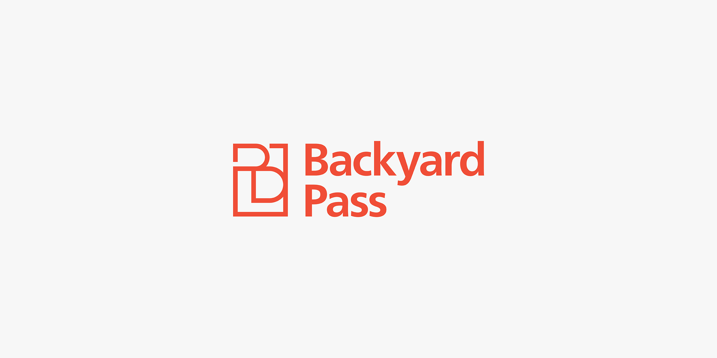
Using a grid system, we designed a symbol that subtly represents an image of a ‘pass’, as well as a monogram of the letters ‘B’ and ‘P’.
We used a humanist sans-serif typeface as these typefaces are clear and highly legible at a distance or at small text sizes. This is especially important for the brand as its primary customer touchpoint will be in the digital sphere, like a mobile-friendly website and various social media platforms.

For the brand’s primary colours, we chose a variation of the colours green and orange, forming a complementary colour scheme–colours that are at opposing ends of the colour wheel. This type of colour scheme is scientifically proven to be pleasing to the eye because they naturally play off of one another’s intensity.
Dark greens are often regarded as soothing and are often associated with nature and the outdoors. At the opposite end of the colour wheel, Orange is often associated with excitement, enthusiasm, and warmth.
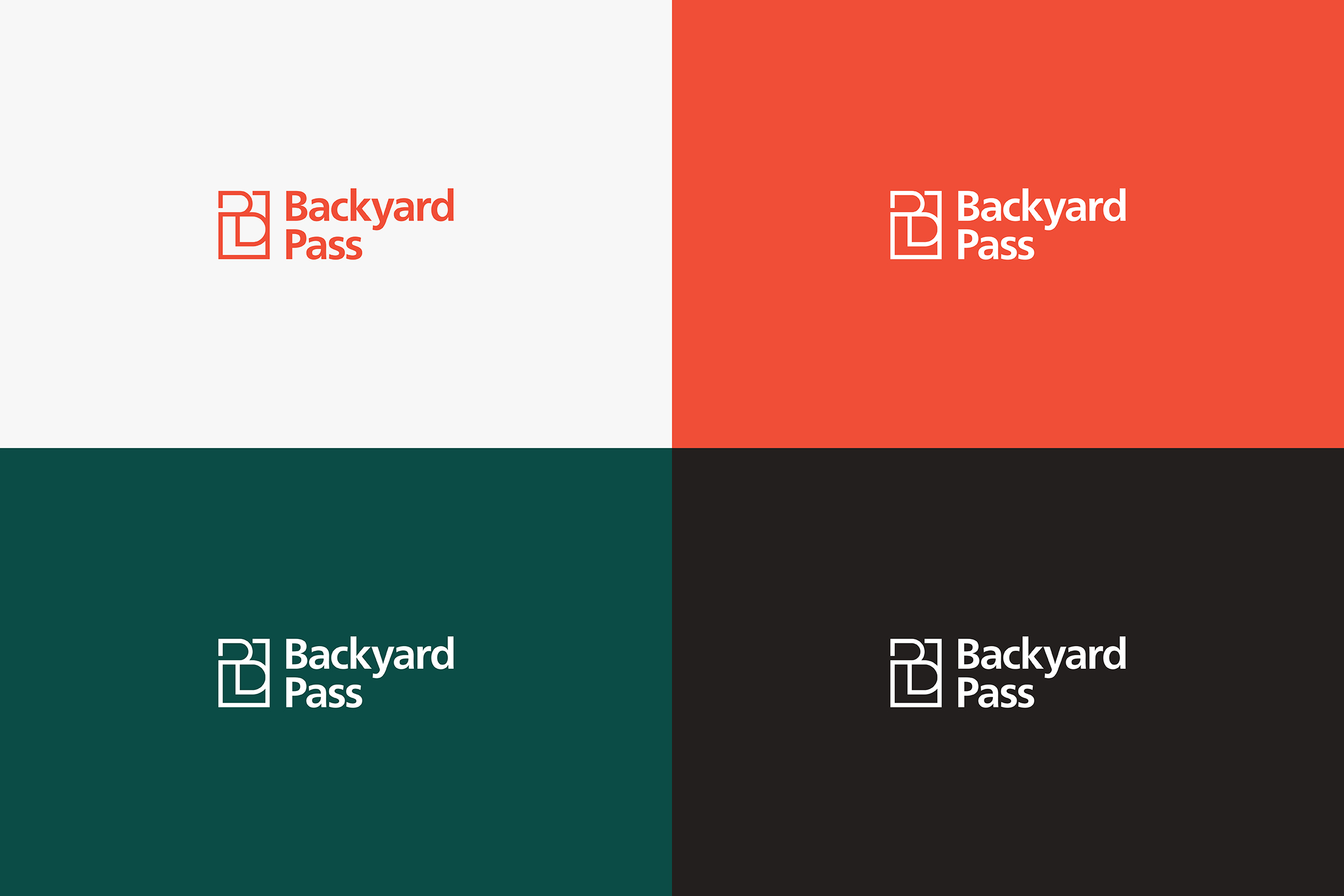
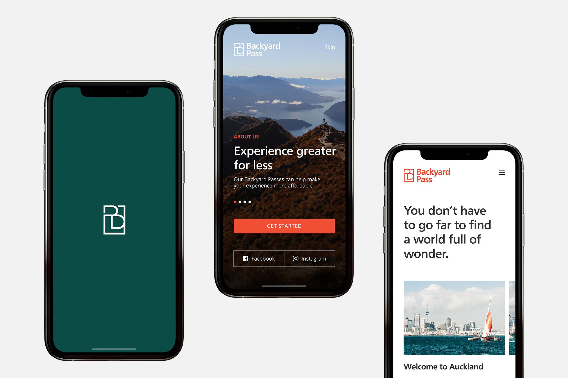
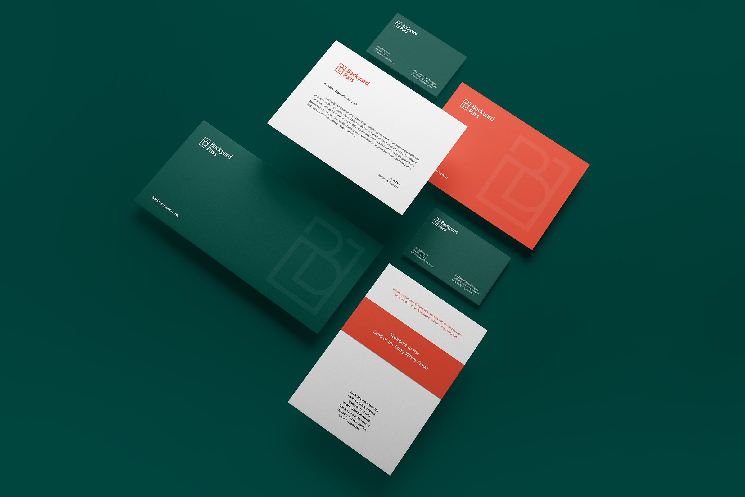
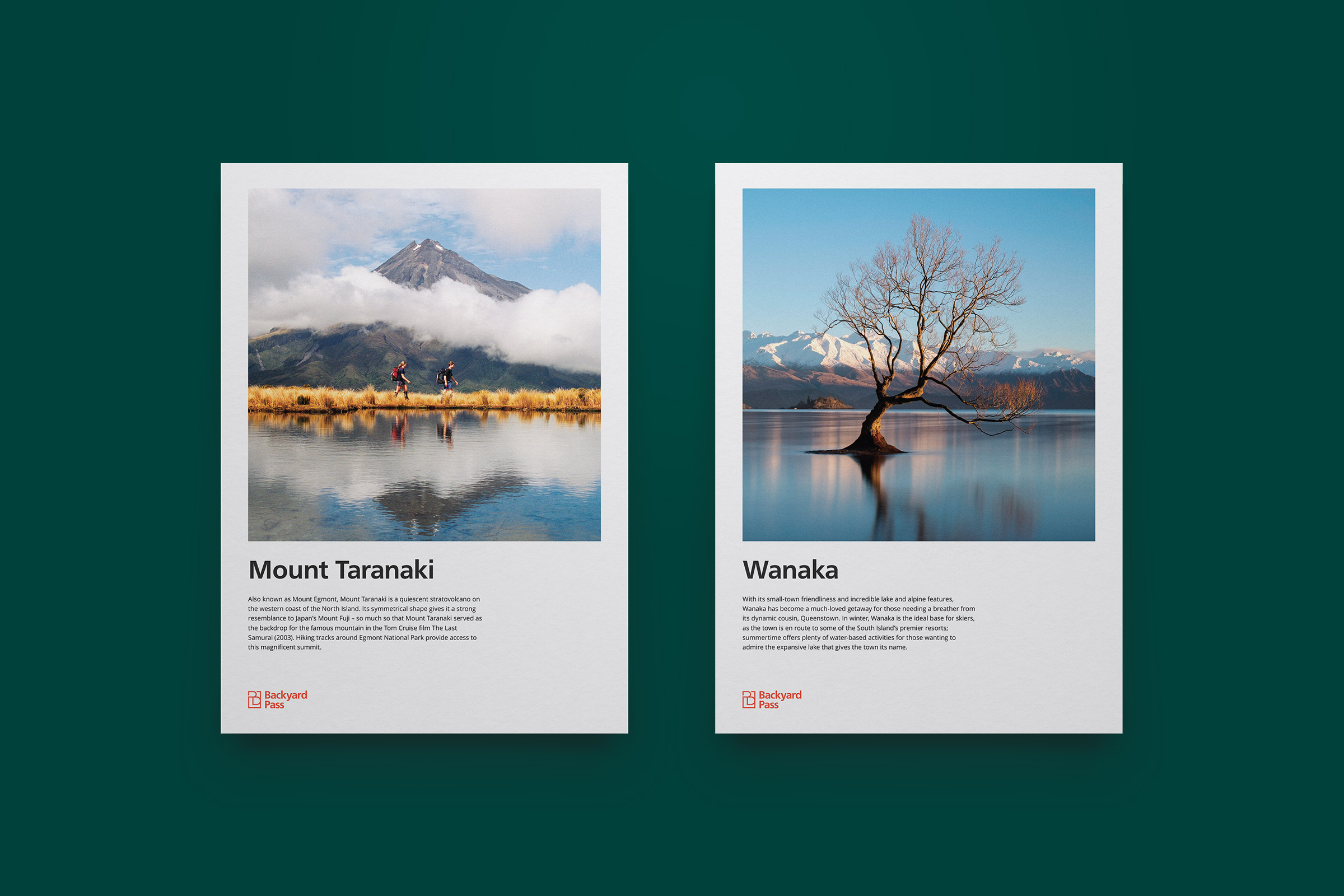
Finally, we imagine the brand in application. We created a visual language through the use of icons, UI and print concept designs.
