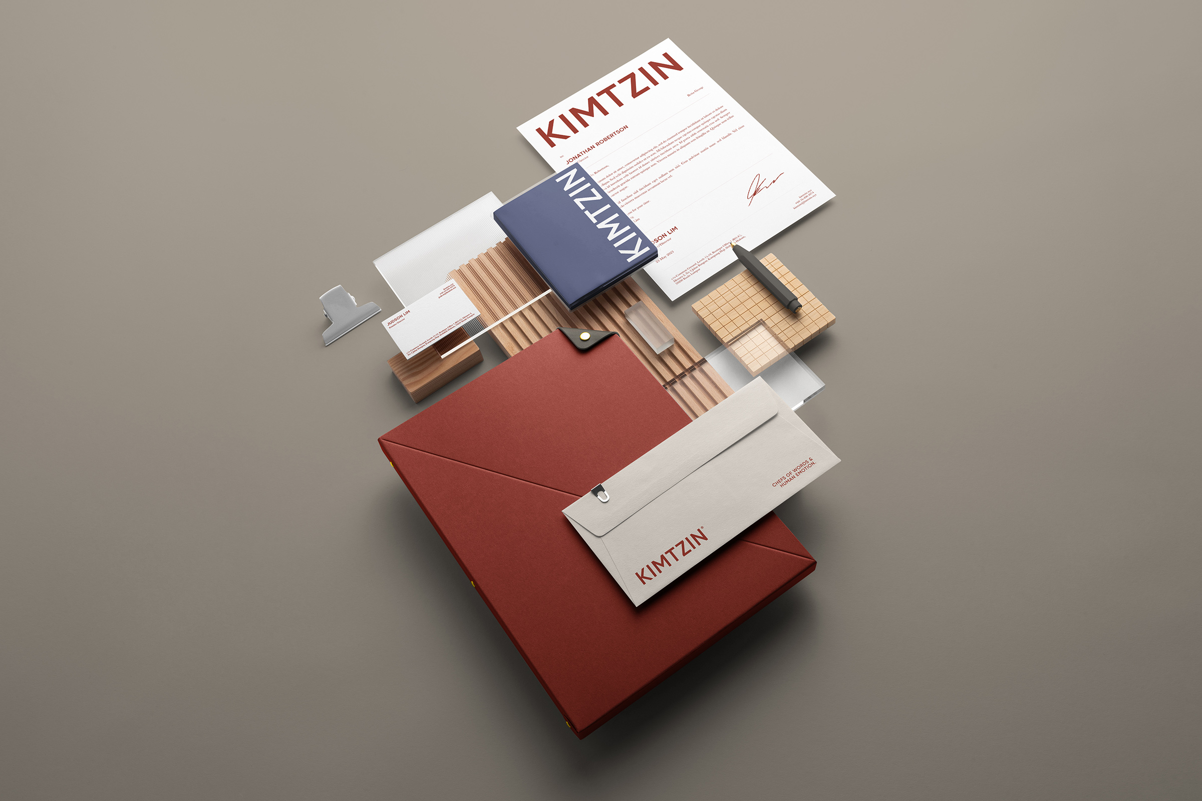
On the face of it, the assignment seemed simple: KIM TZIN wished to communicate efficiency & creativity.
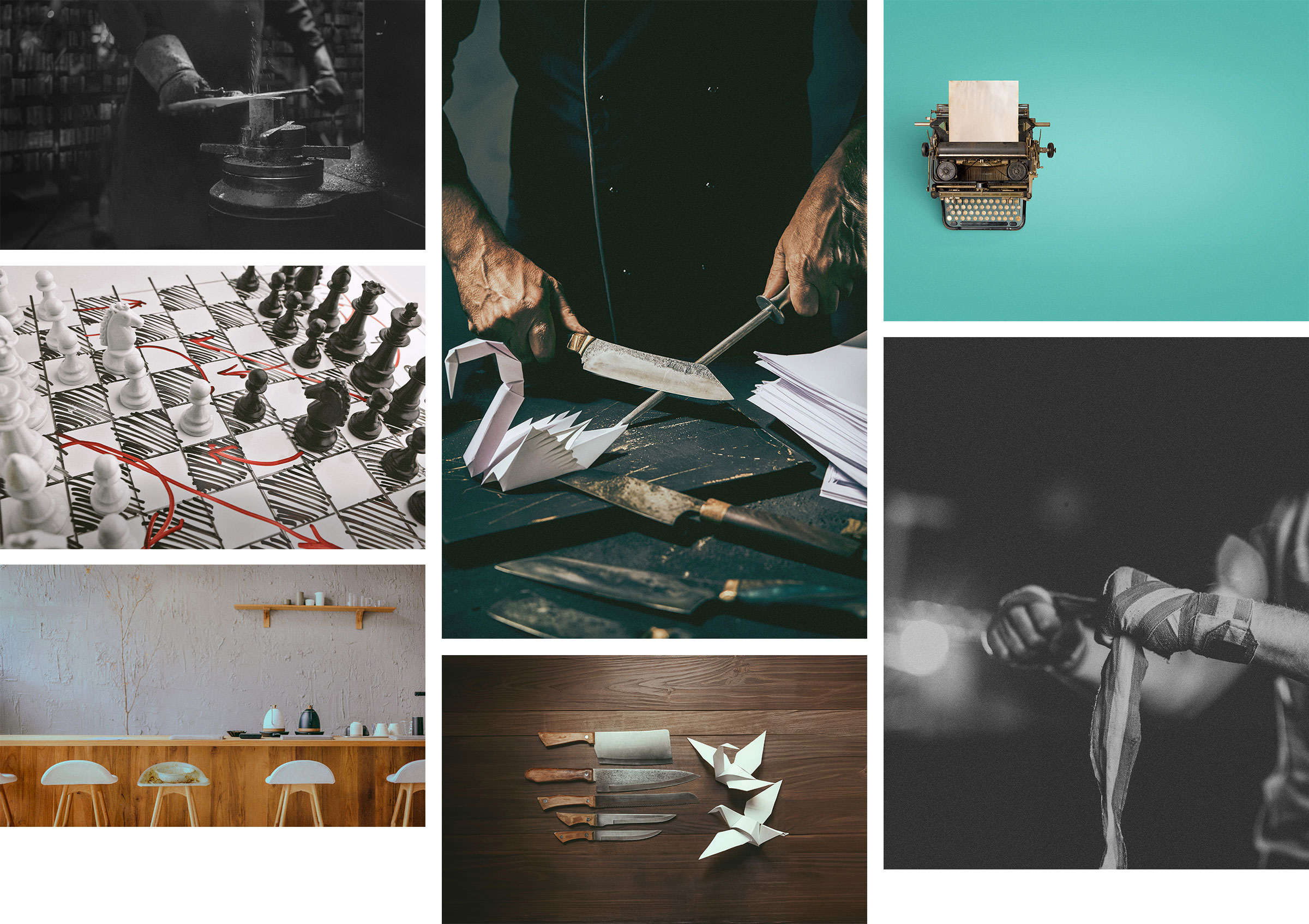
It required the brand emphasise shrewdness in solutions and deadliness in outcome. The 'chef's knife' was the imagery offered.
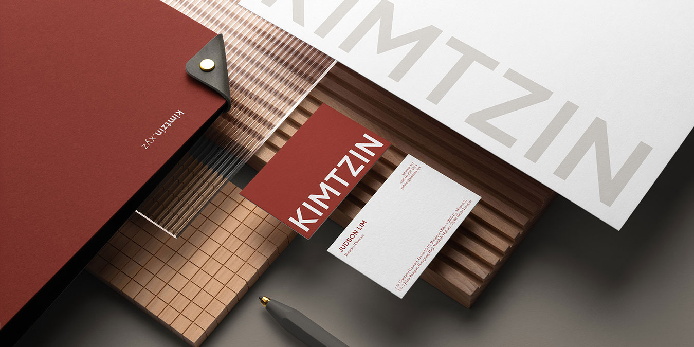
Yet, the partners demanded that efficiency must be achieved without compromising on beauty.
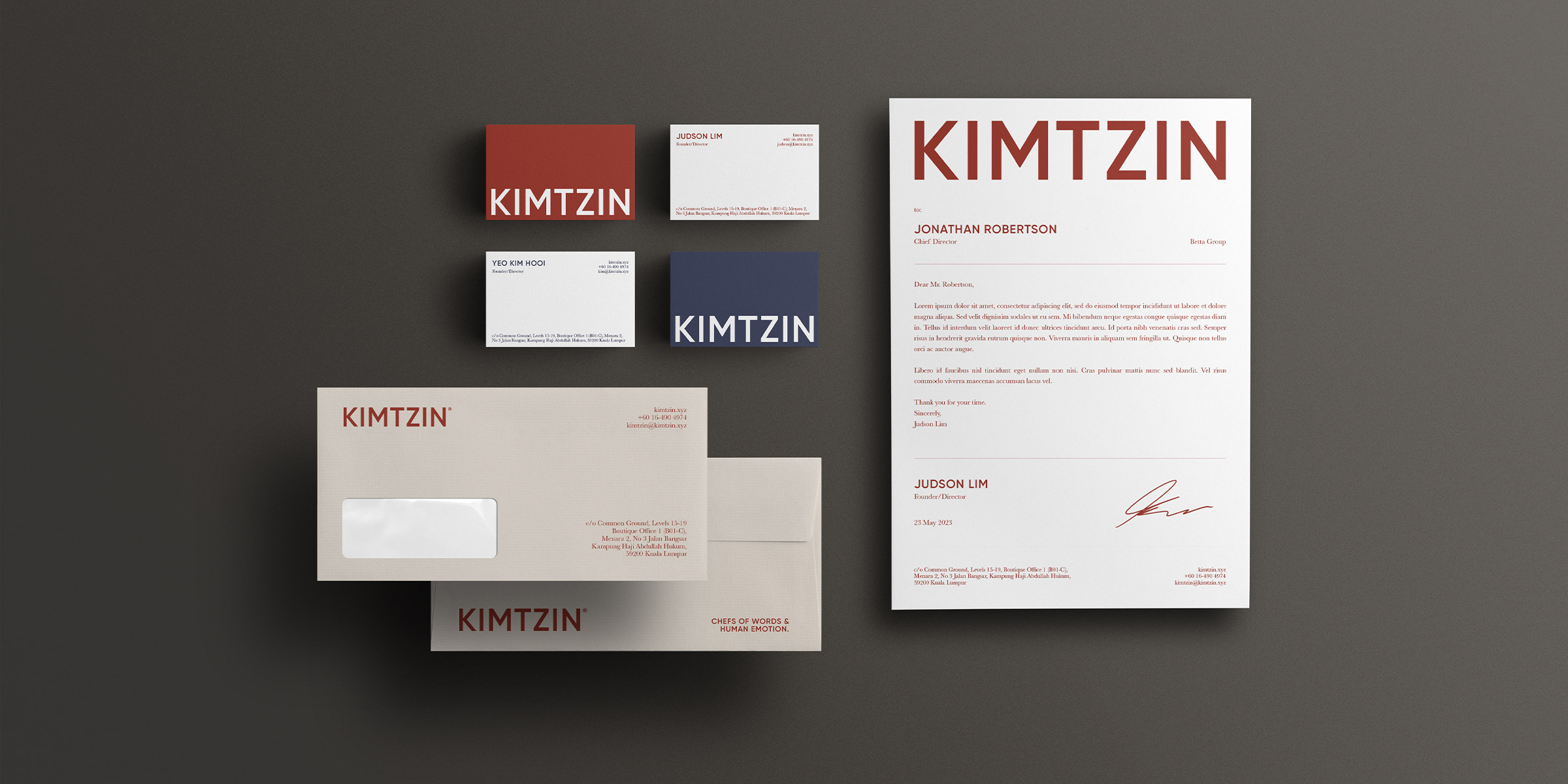
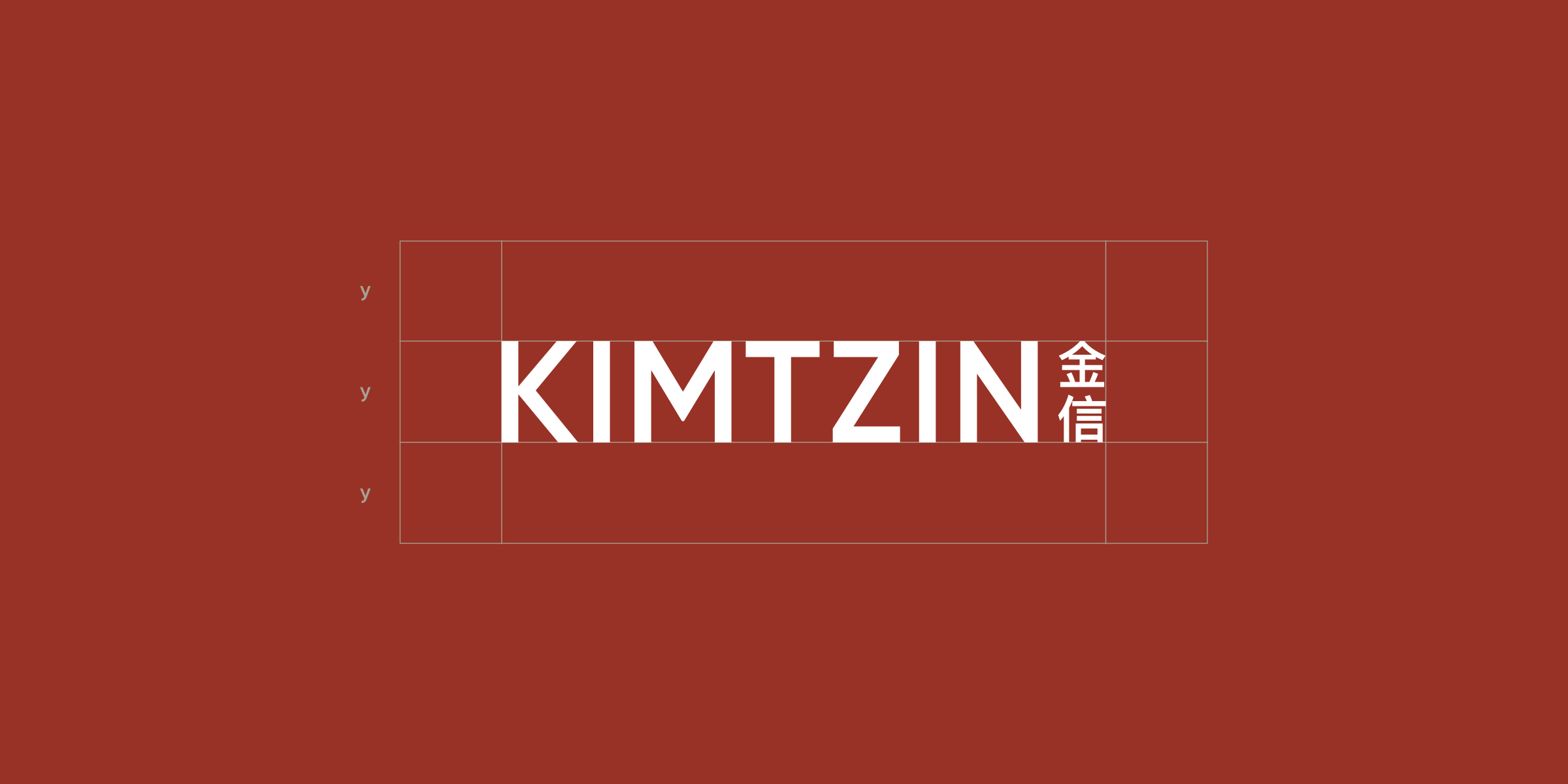
From that, the contrasting sans serif serif typeface was conceived.
The partners underscored that service will be delivered with the 'girlfriend experience', a controversial adjective in their profession.
The brand needed a secondary logo with an edge—with inspiration from outside its often lacklustre industry.
To accompany the sharpness of the logo and the contrasting typeface, visual style is focused on natural lighting, warmer softer edits (low contrast), minimalist compositions and elements of fine art or photography.